The client’s original UI was visually outdated and not meeting the consumer needs, it was difficult for users to find the insights in the data that they needed to detect a cyber attack.
We partnered with our client to provide a customer-facing dashboard that enabled users to easily detect potential cyber attacks which was not only user-friendly but also met accessibility standards.
We delivered a refined user experience, combining technical expertise with a visually appealing UI.
The client was struggling with their customer-facing dashboard which was not providing the experience required by their end-users.
Their original UI was visually outdated and not meeting the consumer needs, it was difficult for users to find the insights in the data that they needed to detect a cyber attack. Following discovery we identified that there was a need to revise the information provided, to avoid repetition and include the ability for the user to customize based on their profile. The visual hierarchy of the console needed to be enhanced to bring the key consumer information to the forefront so that the user could see priority information at a glance, then drill into the detail where appropriate. Threats needed prioritization so that high-risk or higher-priority threats alerts were highlighted and not portrayed in the same way as low risk. This would prevent users’ need to manually consider alert levels and potentially miss high-risk or higher-priority threats. Appnovation was engaged because of our broad experience across multiple sectors and our user centric approach to bring UX / UI learnings to the subject matter experts. We worked in partnership bringing our expertise together as an extension of their team.
Appnovation helped the client’s team transform its customer-facing dashboard into an enticing and accessible platform, empowering users to grasp critical insights and efficiently manage cyber threats quickly.
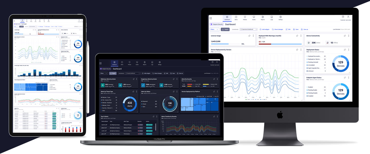
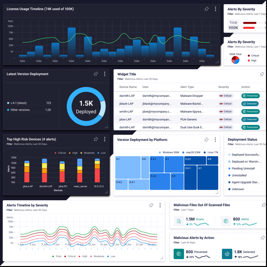
We’d started this engagement as a dashboard redesign but quickly pivoted to develop a management console with a dashboard on top of it, including the ability to drill down into the data and customize individual views.
During this exploration we had no limitations to design so we wanted to push the visuals as much as possible. We created very explorative UI dashboard screens to make data engaging and visually impactful. There was very little to adhere to regarding design styles, so everything needed to be designed from the ground up.
UX and UI
We focused on optimizing both the user experience (UX) and user interface (UI) of the dashboard. The original dashboard was outdated visually and not user-friendly. It was also only available in a dark mode. To make it more user-friendly and provide choice, we developed a light mode. This enhanced user experience and accommodated preference. Users can switch between these two modes as needed.
Additionally, there was a considerable amount of horizontal scrolling which is not conducive to a good user experience. Changing to top navigation allowed for a lot of space to dive into the data with a quick view that gives a snapshot of the alert details. When expanded the alert reveals the full details and gives multiple options that the user can then action.
Actionable Insights Made Easier
The new UI design emphasizes threat severity indicators to enhance usability. End-users can more easily understand the severity of threats and make quick decisions on what to tackle first.
Accessibility
Accessibility was a cornerstone of all design decisions taken on the project, with WCAG 2.1, and the newly released WCAG 2.2 guidelines as the basis upon which decisions were made.
This included the usual accessibility considerations such as colour contrast and keyboard operability (including focus states), but also incorporated some of the newer guidelines such as ensuring that drag actions in the interface could also be achieved by single pointer actions and introducing a minimum size for buttons. These considerations helped to ensure the design was future-proofed and had overall usability as its focus.
Appnovation also developed comprehensive technical documentation to assist the client with the development implementation, which defined how to structure pages and which HTML accessibility attributes to add for the benefit of assistive technology users.
This collaboration between Appnovation and our client resulted in a refined user experience, combining technical expertise with a visually appealing UI. Every component was designed to easily switch between day and night mode. With 540 components, the optimized cyber security dashboard and management console has transformed the client’s customer experience providing a visually appealing, user-centric, and accessible solution.